
Managing a Florida business often means juggling website updates, social media posts, and lead tracking while trying to reach customers across smartphones, tablets, and desktop computers. A responsive website is the foundation for a powerful online presence, making content readable and appealing regardless of device. Responsive design improves usability and directly correlates with user effectiveness, which is especially important for local service businesses competing in busy markets. Discover how a well-built responsive site helps you save time, attract leads, and avoid common myths that hold back growth.
Table of Contents
- Responsive Website Basics And Common Myths
- How Responsive Design Adapts To Devices
- Core Features And SEO Advantages
- Comparing Responsive And Mobile Sites
- Cost, ROI, And Common Pitfalls For SMBs
Key Takeaways
| Point | Details |
|---|---|
| Responsive Design Essential | Responsive web design is crucial for businesses as it ensures consistent user experiences across all device types, enhancing engagement and visibility. |
| Cost-Effective Solution | Utilizing a single codebase for responsive design reduces development and maintenance costs by 30-40%, making it a financially sound choice for small and medium businesses. |
| SEO and User Engagement Benefits | Responsive sites improve search engine rankings and user engagement metrics by eliminating duplicate content and ensuring faster load times. |
| Common Implementation Pitfalls | SMBs must avoid inadequate cross-device testing and over-relying on simple media queries to ensure optimal performance and user satisfaction. |
Responsive Website Basics and Common Myths
Responsive website design represents a critical strategy for Florida businesses seeking digital success. At its core, responsive web design enables websites to automatically adjust and render effectively across multiple screen sizes and devices. This approach eliminates the need for separate mobile and desktop versions, providing a seamless user experience.
The fundamental principles of responsive design involve three key technical components: fluid grid systems, flexible images, and CSS media queries. Fluid grids allow layout elements to resize proportionally, while flexible images scale without losing quality. CSS media queries enable websites to detect screen characteristics and apply appropriate styling rules dynamically. These techniques ensure that whether a user views a website on a smartphone, tablet, or desktop computer, the content remains readable and visually appealing.
Here’s how the main responsive design components contribute to business success:
| Technical Component | Function | Business Impact |
|---|---|---|
| Fluid Grid Systems | Resize layout proportionally | Consistent experience on all devices |
| Flexible Images | Scale graphics without loss | Maintains visual quality on phones and tablets |
| CSS Media Queries | Apply styles by screen type | Optimizes look and feel for any user |
Despite its widespread adoption, several myths persist about responsive design. Some business owners believe responsive websites are expensive or technically complex to implement. However, modern web development tools and frameworks have significantly simplified the process. Another common misconception is that responsive design negatively impacts performance. In reality, well-implemented responsive sites can be just as fast and efficient as traditional fixed-width designs. Research indicates that user effectiveness correlates strongly with responsive design, particularly during situations requiring remote access.
Pro tip: Test your website’s responsiveness using free online tools like Google’s Mobile-Friendly Test to quickly identify and resolve potential design issues across different devices.
How Responsive Design Adapts to Devices
Responsive web design represents a sophisticated approach to creating flexible digital interfaces that dynamically adjust to diverse device characteristics. Advanced media queries and flexible layouts enable websites to intelligently reconfigure their visual presentation based on screen dimensions, resolution, and interaction capabilities. This approach ensures optimal user experiences across smartphones, tablets, desktops, and emerging device categories.

The technical mechanisms driving device adaptation involve multiple sophisticated strategies. Fluid grid systems allow content containers to resize proportionally, maintaining visual hierarchy and readability. Flexible image techniques ensure graphics scale smoothly without pixelation or distortion. CSS media queries act as intelligent switches, detecting device characteristics and applying appropriate styling rules dynamically. These techniques collectively enable websites to provide seamless experiences regardless of screen size or device type.
Emerging device interfaces are pushing responsive design beyond traditional screen adaptations. Modern responsive techniques now accommodate unique form factors like foldable smartphones, augmented reality glasses, and wearable technology. This future-proofing approach requires designers to think beyond fixed layouts, creating interfaces that can dynamically transform based on complex device interactions and novel screen configurations.
Pro tip: Use browser developer tools to simulate different device sizes and test your responsive design’s adaptability across multiple screen dimensions.
Core Features and SEO Advantages
Responsive web design represents a strategic approach that significantly enhances a website’s search engine optimization performance. Mobile-friendly design principles ensure that websites meet Google’s critical ranking criteria by providing consistent user experiences across all device types. This approach directly impacts search visibility, engagement metrics, and overall digital marketing effectiveness for Florida businesses.
The core technical features of responsive design include fluid grid systems, flexible image scaling, and adaptive CSS media queries. These elements work together to create websites that automatically adjust layout, content size, and navigation based on screen dimensions. By maintaining a single URL structure and eliminating duplicate content, responsive design simplifies site management and strengthens search engine indexing capabilities. Search algorithms prioritize sites that deliver seamless experiences, making responsive design a crucial competitive advantage.
Improved user engagement metrics directly correlate with responsive design implementation. Faster load times, intuitive navigation, and mobile optimization reduce bounce rates and increase time-on-site, signaling to search engines that the content is valuable and relevant. For Florida businesses, this translates into higher search rankings, increased organic traffic, and enhanced digital visibility across smartphones, tablets, and desktop computers.
Pro tip: Regularly test your website’s mobile responsiveness using Google’s free Mobile-Friendly Test tool to identify and resolve potential optimization issues.
Comparing Responsive and Mobile Sites
Comparative design approaches reveal significant differences between responsive websites and dedicated mobile sites. While mobile-specific sites traditionally targeted smartphone users with custom interfaces, responsive design offers a more comprehensive solution that adapts seamlessly across all device types. This approach provides Florida businesses with a more versatile and cost-effective digital presence.
The technical distinctions between these approaches are profound. Mobile sites require separate development and maintenance, creating distinct codebases for different devices. In contrast, responsive websites utilize a single, flexible framework that dynamically adjusts layout, content, and functionality based on screen size and device capabilities. This unified approach simplifies website management, reduces development costs, and ensures consistent user experiences across smartphones, tablets, and desktop computers.
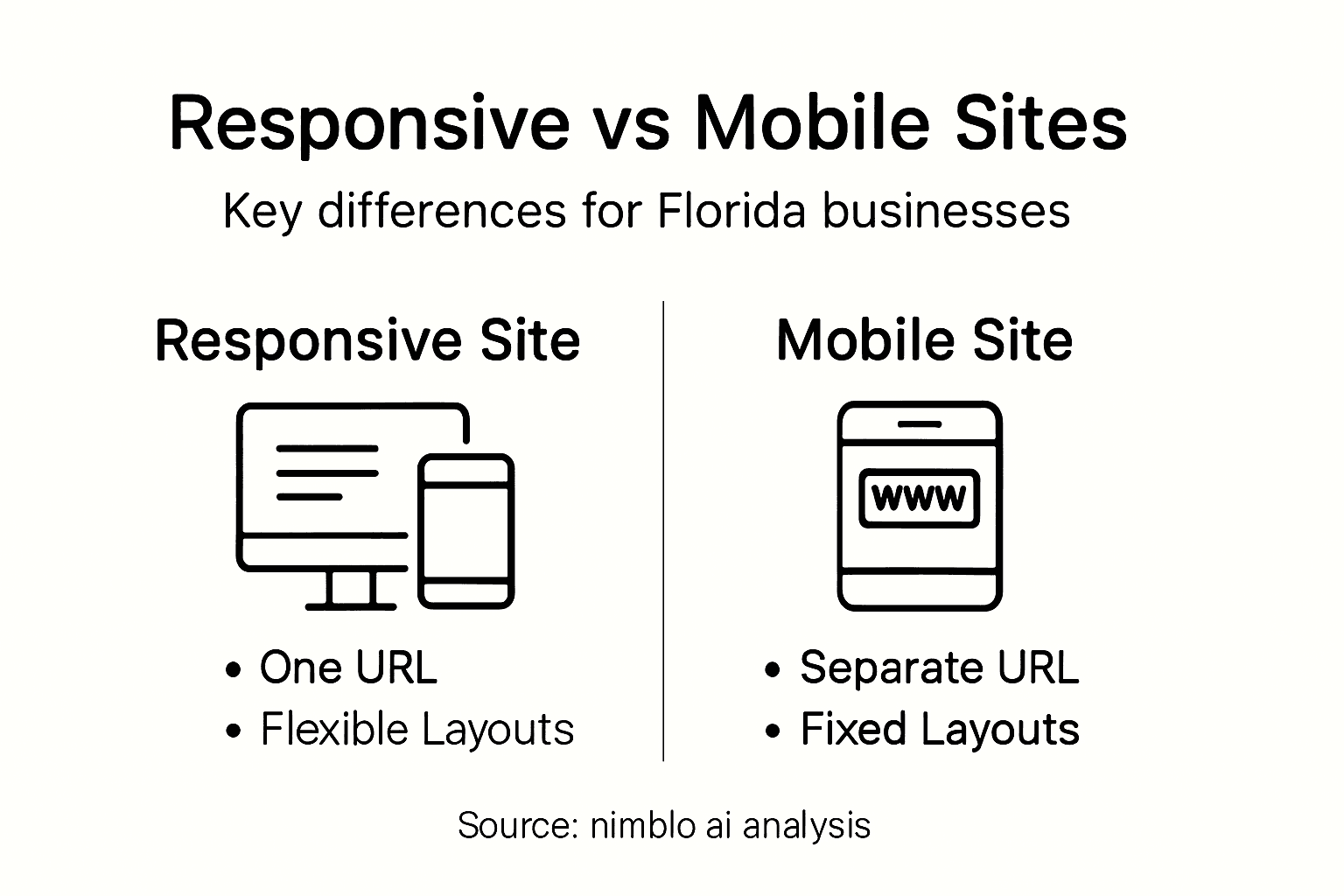
Compare responsive sites and dedicated mobile sites to understand strategic differences:
| Criteria | Responsive Website | Dedicated Mobile Site |
|---|---|---|
| Development Approach | Single codebase | Multiple codebases |
| Maintenance Complexity | Simplified | More difficult |
| SEO Advantages | Strong, avoids duplication | Weaker, split URLs |
| User Experience | Consistent across devices | Fragmented, device-specific |
Web design strategies demonstrate that responsive design offers substantial advantages in search engine optimization and user engagement. By maintaining a single URL structure, responsive sites eliminate content duplication issues and provide more consistent tracking and analytics. Mobile-specific sites often struggle with fragmented user experiences and higher maintenance complexity, making responsive design a more strategic choice for businesses seeking efficient and adaptable digital platforms.
Pro tip: Conduct periodic cross-device testing to ensure your website maintains optimal performance and user experience across different screen sizes and devices.
Cost, ROI, and Common Pitfalls for SMBs
Strategic investment approaches demonstrate that responsive web design offers significant financial advantages for small and medium businesses in Florida. By consolidating development efforts into a single, adaptable platform, companies can reduce overall digital infrastructure costs by 30-40%. This approach eliminates the need for separate mobile and desktop sites, streamlining maintenance and reducing long-term technological expenses.
The return on investment for responsive design extends beyond immediate cost savings. Businesses experience enhanced user engagement through improved mobile traffic, lower bounce rates, and higher conversion potential. Advanced responsive techniques enable seamless experiences across smartphones, tablets, and desktops, effectively expanding market reach without additional infrastructure investments. The ability to future-proof digital assets against emerging device technologies provides a sustainable competitive advantage for Florida small businesses.
Web design challenges reveal critical pitfalls that SMBs must navigate carefully. Common mistakes include inadequate cross-device testing, performance optimization neglect, and over-reliance on simplistic media queries. These errors can lead to suboptimal user experiences, reduced search engine rankings, and potential customer loss. Successful implementation requires strategic planning, continuous performance monitoring, and a commitment to accessibility across diverse technological environments.
Pro tip: Invest in comprehensive device testing and performance monitoring tools to proactively identify and resolve responsive design issues before they impact user experience.
Unlock Powerful Responsive Design Benefits for Your Florida Business Today
Responsive website design is essential for Florida businesses aiming to deliver seamless experiences across smartphones, tablets, and desktops. If you want to avoid common pitfalls like device inconsistencies, slow load times, and poor SEO rankings highlighted in the article responsive design must adapt effortlessly while being optimized locally. You deserve a solution that simplifies management, boosts site speed, and enhances user engagement on every screen size.
Take control now with Nimblo.ai Your all-in-one platform designed especially for Florida SMBs includes AI-powered local SEO, automated lead generation, and conversion-optimized web design. Nimblo helps you cut costs by replacing multiple tools and agencies ensuring your responsive site performs fast and ranks higher across devices. Don’t settle for fragmented digital marketing efforts when you can streamline everything with expert local support at a flat rate. See measurable lead growth like other Florida businesses and test your mobile-friendly site’s effectiveness today. Start transforming your online presence with Nimblo.ai and experience the rapid setup, local optimization, and performance your business deserves.
Frequently Asked Questions
What is responsive web design?
Responsive web design is a method that allows websites to automatically adjust their layout and content to fit various screen sizes and devices, providing a consistent user experience across smartphones, tablets, and desktops.
How does responsive design benefit businesses?
Responsive design helps businesses by improving user engagement, enhancing search engine visibility, and reducing maintenance costs through a single adaptable platform rather than managing separate mobile and desktop sites.
What are the key components of responsive web design?
The key components include fluid grid systems, flexible images, and CSS media queries. These technologies work together to ensure that a website is visually appealing and functional across different devices.
Why is responsive design important for SEO?
Responsive design is essential for SEO because it provides a seamless user experience, maintains a single URL structure, and avoids duplicate content, all of which are favored by search engines like Google for ranking purposes.